What is a UI Style Guide, and why it is a useful tool?
Starting to plan the design of your project has the utmost importance for its future realization. What is even more – it can bring you a lot of benefits that can give you a great starting push. Nowadays, the attention span of online browsers (readers), or potential customers, has drastically lessened. The key to creating a good-looking and workable design definitely depends on a good UI (user interface). The result of that will be a greater UX (user experience), which is a major factor not only to attract new users to your website but also to ensure their revisits.
One of the hardest parts of creating a good design is to strike the right balance between beauty and functionality. This can be a subject of a whole study you can feel lost and helpless. But with a good UI Style Guide, you basically create a strict A to Z plan for your entire project and that’s a solid start for its good execution.
There are tons of UI Style Guides that can help you create beautiful and original designs. Yet it’s hard to search for the best ones, especially for something that will work for your needs. This article aims to guide you through the process of creating your own UI Style Guide that will ensure your project’s better results with lesser effort.
UI Style Guide will lead your way
There are lots of aspects to consider when you are about to start the design process and an essential part of it is the cooperation of the team working on it. UI Style Guide provides a set of elements, typography, and colors that provide guidance and documentation for reference to the team working on a project. The designers, developers, and stakeholders should be able to communicate and collaborate throughout the whole process of creating a consistent UI. UI Style Guide is defining rules for all of them and makes sure they’re speaking the same language.
The most attractive style guides are those that explain different elements from a developer, a UI designer, and a graphic designer’s point of view. In that way, you can ensure that the team works on the same page in regard to the sets of standards that they need to follow to provide a consistent and solid product at the end. Making use of it brings cohesion to a website/app user interface (UI) and experience (UX).
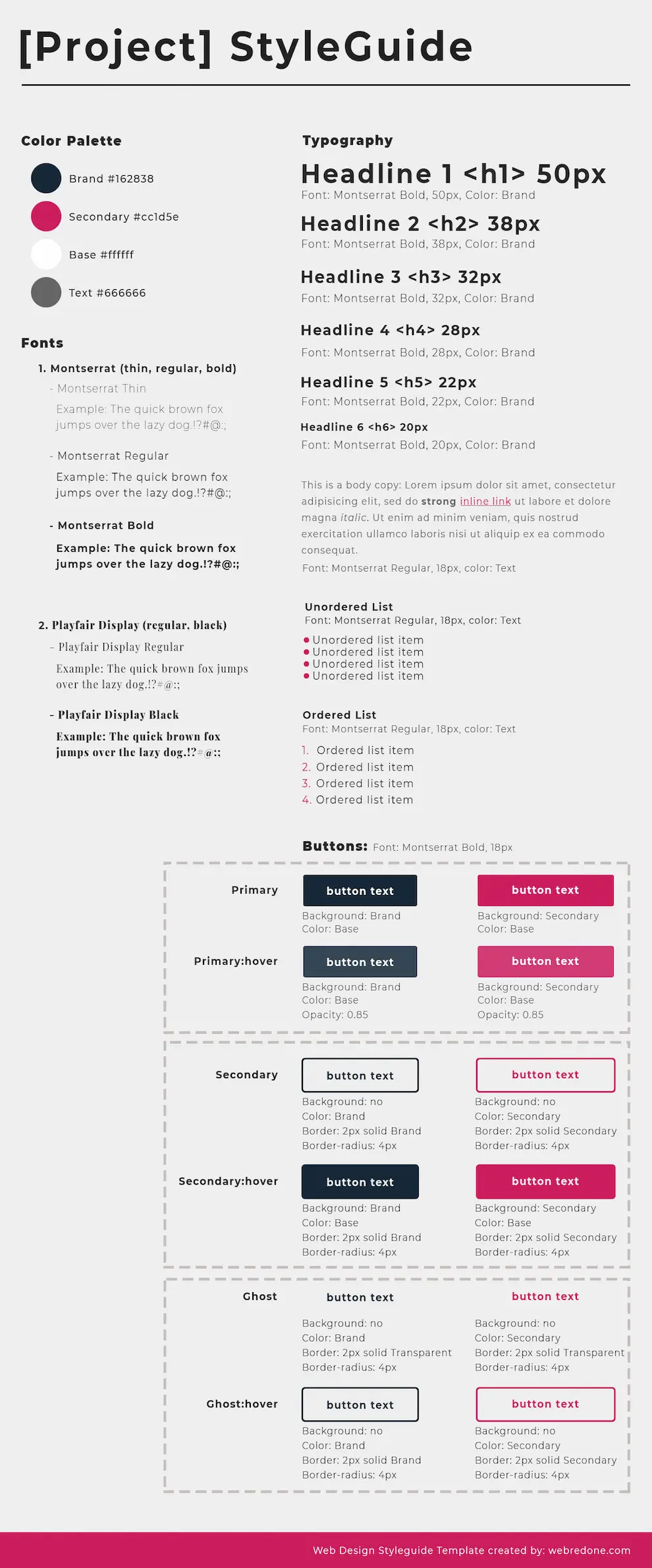
Here’s an example of a UI Style Guide template:
Here is the right moment to say that there is no universal fit-for-all UI Style Guide and you will hardly find one on the Internet. That’s because every business has its own peculiarities and a simple template may not work great in every case. The best way is to create a custom-made UI Style Guide to be sure that it will serve you the purpose that you need it for. Apart from that, this article will provide you with some crucial elements that are a must in every UI Style Guide.
Main Design Components of a UI Style Guide
Every digital product (website or an app) is composed of reusable design elements.
Those elements include:
- Color palette
Defining a palette of colors that you will use throughout the website is one of the most important parts of the design process. Remember to define colors and stick to them when you start designing. This means that the combination of colors must be listed with the numbers of the matching colors. There shouldn’t be too many variations, even on different pages. It’s also good if you use the main colors of the brand, something that is already familiar to your customers. If you’re only a start-up and haven’t come up with any ideas, it will be of great use if you check similar businesses to see what is working for them. Try to learn from them, but not copy and think about what diversifies your brand and makes it unique. When you define this, it will be much easier to choose the right design elements for your purposes.
- Typography Scheme (Headlines, Paragraphs, Blockquotes, and so on)
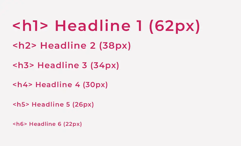
- Typography is definitely a common interface design element. Work with your graphic designer and write clear instructions for Titles, Subtitles, Headings (H1, H2, H3, H4, H5, H6), Body Text, and Captions. Google fonts have a great database with fonts that are safe and easy to use. For better website load time optimization try not to combine too many fonts or font weights. You should also be strict in the determination of font sizes, style, and weight. An important part of the typography standard that you need to consider is the kerning and the line size. You should also think of the purpose of your texts, and what effect you are looking for, as this is a reasonable way to choose between serif and sans-serif fonts.
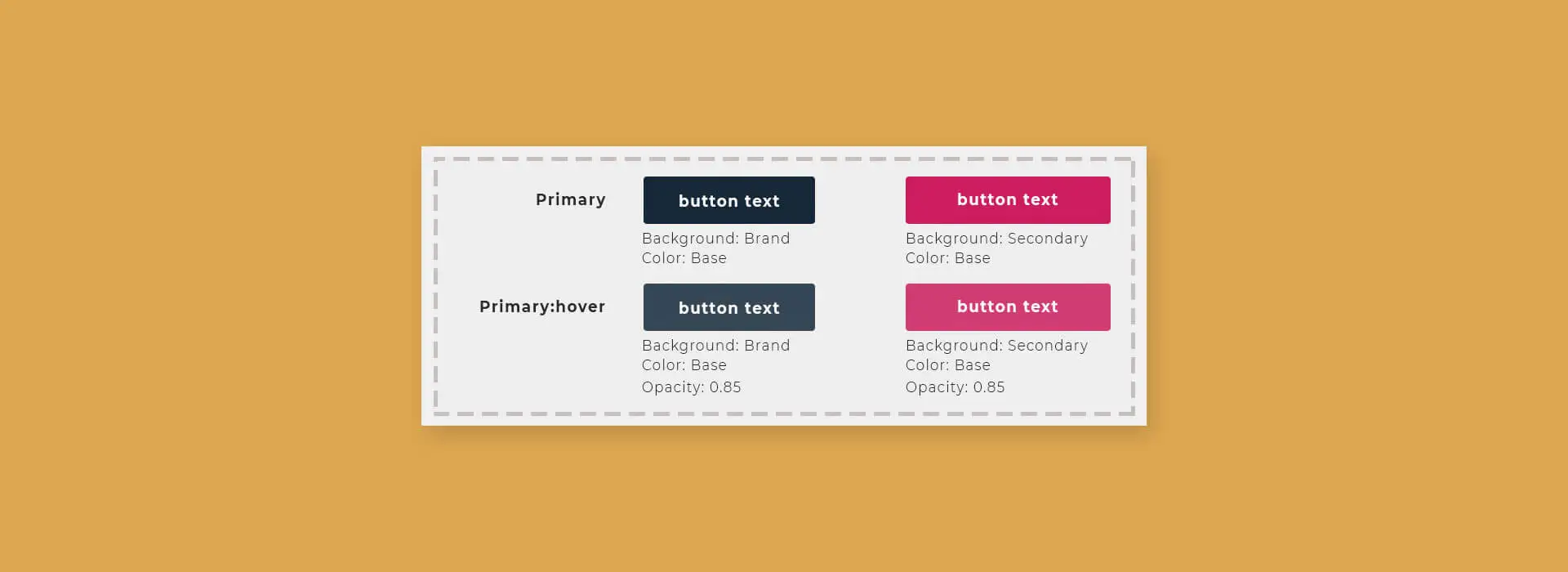
- UI elements (buttons, forms, links, navigation menus, accordions, tabs, images, sliders, icons, modals, etc)
A website without its buttons is like a bird without wings. So, make sure you define a few button variations and reuse them throughout the website. You must include their sizes, colors, styles, spacing, placement, and all other typographic elements. Also, if there is a variation of buttons, make sure you define every purpose and write clarification if needed when and why one or another button is used. The same must be applied to the other elements mentioned. - Responsiveness
This is one of the main features that designers and developers must bear in mind while working on design elements. The Mobile-first rule is now the main feature for almost all kinds of businesses. Nowadays we have so many different screens like tablets, laptops, and even smart TVs. We just can’t ignore the need for responsive layouts (grid system). That means that our UI Style Guides must address interface layouts across all screen sizes. All examples for spacing, padding, and placement must be included. It will also be good if we have an example of the design elements in a mobile version. Here is a list of the most popular screen resolutions. - Additional UI Components
You have a great variety of options when it comes to design elements. But it will be inappropriate if we use all of them. To complete a balanced and powerful design you have to choose several elements and make sure they click together. Simplicity is always modern. Before applying anything inform yourself about the variety of elements and their proper usage. In one way or another users have become familiar with elements acting in a certain way, so choosing to adopt those elements when appropriate will help with task completion, efficiency, and satisfaction.
Interface elements are grouped mainly into three categories: Input Controls (checkboxes, radio buttons, dropdown lists, list boxes, buttons, toggles, text fields, date field), Navigational Components (breadcrumbs, slider, search field, pagination, tags, icons), Informational Components (tooltips, icons, progress bar, notifications, message boxes, modal windows) and containers (accordion). Learn more about them here.
All those together compound the user interface or UI as it is commonly referred to.
Once again, it is important to reuse them to create cohesion in a digital product so that a user can easily learn and adapt to it.
Some common-sense practices
As we have said above, the UI Style Guide is a tool that makes it easier for you to create consistency and cohesion in designs. We can look at it as a “framework” of reusable elements that, when combined, form a complete UI design (web or app design). But what else can you include in order to make the work of your team even easier:
- Organization and frame of reference
Except for the aforementioned elements, there are a lot of practical decisions that you must include in order to make your UI Style Guide more efficient, understandable, and handy. A table of Content is always a good idea when it comes to references and practical guides and it’s always the easiest way to find the information that you need. - Mark the Dos and Don’ts
If you contextualize this part of your UI Style Guide with lots of pictures and notes, this can save time for the developers. Also, the usage of bullet points and paragraphs will make everything a lot more readable and good-looking.
Tools to create UI Style Guides
In the beginning, designers started to create style guides manually and all by themselves, and that cost time and a lot of work. After a while, they started to automate the workflow, and slowly style guide tools appeared and made it easier to create well-organized UI style manuals. This doesn’t mean that they don’t use Photoshop. There are new techniques you just can’t ignore, tools like Adobe XD, Figma, and Sketch that make the design process easier, intuitive, and fun.
Major benefits of UI Style Guide
Let’s once again point out why a solid, well-rounded style guide will have crucial importance for your business:
- It ensures you’re consistent (and consistency is an important part of a branding strategy)
- It saves time and makes communication between teams more efficient
- Reduces redundant work
- Components are easier and faster to test
- UI Style Guides are especially important when there are many designers working on a product
We live in a time when the virtual world is evolving every day. The key to surviving is to adapt and the best way to do it is when you have a straight-to-the-point and clear concept of what you’re doing and how you want to achieve it. Creating a good UI Style Guide is a great chance for you to be unique and to work to the best of your potential in an ever-changing environment.